
How UX design affects event bookings explains how user experience influences booking decisions. A smooth, intuitive, and mobile-friendly design reduces friction, builds trust, and improves conversion rates, helping event platforms attract more users and increase successful ticket sales.
UX design affects event bookings by reducing friction, building trust, and guiding users smoothly from search to checkout. Clear navigation, fast pages, transparent pricing, and mobile-friendly design directly increase conversions, while poor UX drives drop-offs and abandoned carts.
Every successful event booking starts long before someone hits “confirm.” It begins with the first search, the first page load, and the first impression your platform makes. That moment quietly shapes whether a visitor becomes a buyer or bounces to a competitor.
Most event organizers obsess over marketing spend and ticket pricing. Fewer pay attention to the silent force working behind every transaction: user experience. Yet how UX design affects event bookings is evident at every step of the user journey. From browsing events to completing payment, design choices directly influence confidence, clarity, and conversion rates.
This guide breaks down exactly how UX design affects event bookings. You’ll learn the core principles of good event UX, the elements that drive higher conversions, the metrics that prove what’s working, and the common mistakes that cost you sales. Whether you run a small workshop or a stadium tour, these insights will help you turn more visitors into ticket holders.
Good UX is not just about aesthetics—it is about reducing cognitive load. When users can easily find event details, compare options, and complete checkout without confusion, they are far more likely to finish their purchase. Small improvements like faster load times, clear call-to-action buttons, and simplified forms can significantly increase booking rates.
Mobile optimization also plays a major role. A large percentage of users browse and book events on smartphones, so responsive design is no longer optional. Platforms that prioritize mobile-first UX consistently see higher engagement and fewer abandoned bookings.
Ultimately, understanding how UX design affects event bookings helps organizers create smoother, more enjoyable user journeys that directly translate into increased revenue and stronger customer satisfaction.
What is UX design in the context of event booking?
 UX design refers to how a user experiences a platform across every interaction—how easy it is to navigate, how fast it loads, and how confident it makes someone feel when handing over payment details. For event platforms, how UX design affects event bookings becomes clear across the entire journey—from discovering an event to receiving a digital ticket.
Good UX isn’t just about looking pretty. Aesthetics matter, but usability matters more. A beautiful page that confuses users still loses sales. The goal is a platform that feels effortless, where every step makes intuitive sense and supports higher event booking conversion optimization.
The three pillars of good event UX
Strong event UX design rests on three principles:
Usability: Can users complete tasks quickly and without confusion? Simple navigation and a clear checkout flow are essential for improving event website UX design impact on bookings and reducing drop-offs.
Accessibility: Can everyone use your platform, including people with disabilities? Accessible design widens your audience, improves trust, and strengthens overall user experience for event websites.
Desirability: Does the experience feel trustworthy and enjoyable? Clean visuals, transparent pricing, and instant confirmations build confidence and support better UX design for ticket booking performance.
Why UX matters in event booking platforms
UX design directly influences whether a visitor completes a purchase or abandons the process. Even small friction points—like slow-loading pages, unclear pricing, or complicated forms—can significantly reduce conversions. On the other hand, streamlined flows and clear calls-to-action encourage users to complete bookings faster.
Modern users expect instant clarity. They want to see event details, seating options, and total costs without extra clicks. When platforms meet these expectations, they see higher engagement and improved booking rates.
Key UX elements that improve event bookings
- Simplified navigation that helps users find events quickly
- Fast-loading pages that reduce frustration and bounce rates
- Transparent pricing to build trust and avoid surprises
- Mobile-first design for on-the-go bookings
- Smooth checkout flow with minimal steps
Together, these elements show clearly how UX design affects event bookings by shaping user confidence and reducing friction at every stage.
The journey from first click to confirmed booking
Every booking follows a path: discovery, comparison, decision, and checkout. As research on how users interact with event ticketing platforms shows, each stage reflects different user intent and emotions. UX design either smooths that path or throws up roadblocks at every turn.
How does UX design affect event booking conversion rates?
The connection between user experience for event websites and conversions is direct and measurable. Every point of friction costs you bookings, while every improvement recovers them. According to the Baymard Institute, the average cart abandonment rate sits around 70%, and much of that loss traces back to poor checkout UX.
This is why how UX design affects event bookings is not just a design question—it is a revenue question. Better UX leads to smoother journeys, higher trust, and stronger event booking conversion optimization outcomes.
Streamlined navigation keeps users engaged
When visitors can find what they want fast, they stay. Cluttered menus, broken filters, and slow pages push people away within seconds. Clean navigation is a key part of event website UX design impact on bookings, guiding users naturally toward booking and reducing the chance they’ll give up and leave.
Clear calls to action drive decisions
A confused user rarely buys. Prominent, well-worded calls to action—”Get Tickets,” “Select Seats,” “Checkout Now”—tell users exactly what to do next. Strong CTAs are essential in UX design for ticket booking, while weak or hidden buttons create hesitation and reduce conversions.
Minimizing friction reduces drop-offs
Every extra step in the booking process is a chance for users to abandon. Forced account creation, long forms, and surprise fees all add friction. The fewer obstacles between interest and purchase, the more bookings you’ll capture through improved event booking conversion optimization.
Why event UX design best practices lead to higher conversions
 The platforms that convert best treat UX as a system, not a feature. Fast pages, transparent pricing, mobile optimization, and a frictionless checkout work together. When applied consistently, these event UX design best practices turn casual browsers into confirmed attendees and directly improve booking performance.
Ultimately, understanding how UX design affects event bookings helps businesses prioritize design decisions that directly increase revenue while improving overall user satisfaction.
What are the key elements of effective event UX design?
Strong UX isn’t one big thing—it’s many small details done right. Here are the elements that matter most for event booking conversion optimization.
Intuitive search and filtering
Users arrive with intent. Help them act on it fast. Smart search bars, category browsing, and personalized recommendations surface relevant events instantly. Advanced filters—date, genre, location, and price—let users narrow thousands of options to the handful that fit. The faster someone finds the right event, the closer they are to buying.
Engaging event pages
The event page is where decisions happen. It needs to inform and persuade at the same time.
Effective pages include:
- High-quality visuals and videos that capture the atmosphere and build excitement.
- Compelling descriptions that answer key questions and sell the experience.
- Clear pricing and seating information with no hidden surprises, plus interactive seat maps so buyers know exactly what they’re getting.
Seamless registration and checkout
Checkout is where most bookings are won or lost. A smooth flow includes guest checkout options so users aren’t forced to create accounts, progress indicators that show how many steps remain, and secure, trusted payment gateways that reassure buyers. Addressing abandoned carts with reminder emails can also recover sales that would otherwise vanish.
Mobile responsiveness is non-negotiable
Most users now book on their phones. Mobile-first design isn’t optional—it’s the baseline. Small screens demand large tap targets, simple forms, fast load times, and streamlined navigation. A booking flow that frustrates mobile users loses the majority of your traffic. For deeper insight, this event ticket booking platform guide breaks down the features that make mobile booking painless.
Feedback and customer support integration
Questions arise during booking. When they do, easy access to live chat, FAQs, and support reassures users and prevents abandonment. A visible help option signals that someone has your back, which builds the trust every transaction depends on.
How does personalization improve user experience for event websites?
Personalization turns a generic platform into one that feels built for each visitor. By tailoring the experience to past behavior, you make booking faster and more relevant—both of which lift conversions.
Tailoring the journey based on past behavior
When a platform remembers what a user browsed or bought before, it can surface events they’ll genuinely care about. This reduces search time and makes the whole experience feel effortless. As explored in this guide on personalized event experiences, relevance drives action—people engage more when content matches their interests.
AI-driven recommendations and their impact
Artificial intelligence analyzes behavior to predict what users want next. AI-powered recommendation engines suggest relevant events, while dynamic interfaces adapt to individual preferences. These tailored suggestions make large catalogs feel manageable and personal, nudging users toward bookings they might otherwise have missed.
The future of user experience for event websites
Personalization will only deepen as technology matures. Predictive UX—where platforms anticipate needs before users express them—is already emerging. The organizers who invest in user-centric, personalized design now will own the loyal audiences of tomorrow.
How do you measure UX success for event platforms?
 You can’t improve what you don’t measure. The right metrics reveal exactly where your UX wins and where it leaks bookings.
- Conversion and booking completion rates: The clearest signal of UX health. Track how many visitors complete a booking versus how many start one.
- User satisfaction scores (CSAT and NPS): Survey data shows how users feel about the experience and whether they’d recommend it.
- Time on page and bounce rates: High bounce rates often flag confusing or slow pages, while healthy time-on-page suggests engagement.
- A/B testing: Compare two versions of a page or checkout flow to see which converts better. Continuous testing turns guesswork into data-backed improvement.
Pair these numbers with qualitative feedback. The metrics tell you what happened; user comments tell you why.
What are the most common UX pitfalls in event booking platforms?
Even well-funded platforms make UX mistakes that quietly drain bookings.
Watch for these common traps:
- Overwhelming users with too much information. Cramming every detail onto one screen creates cognitive overload. Prioritize what matters and let users dig deeper if they choose.
- Broken links and dysfunctional elements. Nothing erodes trust faster than a button that doesn’t work or a page that won’t load. Regular testing catches these before users do.
- Unclear communication. Vague error messages leave users stuck. Tell them exactly what went wrong and how to fix it—”Your card number is missing a digit” beats “Error occurred.”
- Ignoring accessibility standards. Inaccessible platforms exclude a significant audience and risk legal trouble. Accessible design is both ethical and profitable.
What can we learn from real-world UX examples?
The contrast between good and bad UX shows up in the numbers.
A platform that excels with great UX keeps things simple. Imagine a ticketing site where a user searches, filters by date, picks a seat from an interactive map, and checks out as a guest in under two minutes. Clear pricing, instant confirmation, and a mobile-friendly flow turn first-time visitors into repeat buyers. Specialized platforms like TodayTix built loyal followings precisely by stripping friction from theater bookings.
A platform that struggles with poor UX does the opposite. Picture a site with slow pages, a confusing seat map, forced account creation, and surprise fees revealed only at checkout. Each obstacle sheds users, and abandoned carts pile up. The event might be in demand, but the platform sabotages its own sales.
The lesson is consistent: design around the user, and bookings follow.
How do you implement event UX design best practices?
Great UX comes from a deliberate, repeatable process rather than guesswork.
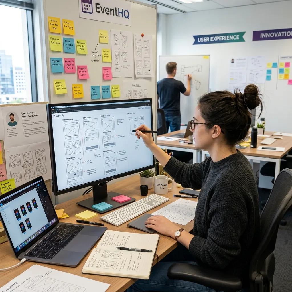
- User research and empathy mapping. Start by understanding who your users are, what they want, and where they struggle. This grounds every design decision in real needs.
- Wireframing and prototyping. Sketch the booking flow before building it. Prototypes let you test ideas cheaply and catch problems early.
- Usability testing. Watch real users navigate your platform. Their stumbles reveal friction you’d never spot on your own.
- Iterative design. UX is never finished. Launch, measure, refine, and repeat. The best platforms improve continuously based on data and feedback.
How do UX and SEO work together for event platforms?
UX and SEO are deeply connected. Good user experience doesn’t just convert visitors—it helps them find you in the first place.
How good UX contributes to better search rankings
Search engines reward sites that users love. Fast load times, mobile responsiveness, low bounce rates, and strong engagement all feed into rankings. When your UX keeps people on the page and moving toward booking, search engines notice and reward you with visibility.
AI visibility through user-centric design
Clear, well-structured content also helps AI-powered search tools understand and surface your platform. Logical navigation, descriptive headings, and accessible design make your content easier for both users and algorithms to interpret. User-centric design is increasingly the foundation of AI visibility optimization.
Making UX the cornerstone of event booking success
 UX design affects event bookings at every single stage. From the first search to the final confirmation, each touchpoint either moves a user closer to buying or pushes them toward the exit. Streamlined navigation, clear CTAs, mobile-first design, transparent pricing, and a frictionless checkout work together to convert browsers into buyers.
The platforms that win treat user experience as an ongoing commitment, not a one-time project. They research their audience, test relentlessly, and refine based on real data. As AI and personalization mature, the bar for great UX will only rise—and the organizers who prioritize it now will lead the pack.
Start small. Audit your current booking flow, identify two or three points of friction, and fix them. Measure the impact, then keep improving. For more on building seamless experiences, explore this guide on improving attendee experience at events and see how reducing friction at every stage keeps audiences coming back.
Conclusion
UX design is a critical driver of success in event booking platforms. When users can easily navigate, find information, and complete checkout without friction, they are far more likely to convert into paying attendees. Every small improvement in usability, speed, and clarity directly impacts booking rates and customer satisfaction.
Ultimately, making UX a priority is not just a design choice—it is a business strategy. Platforms that invest in strong UX design consistently achieve higher conversions, reduced drop-offs, and stronger user trust, turning casual visitors into loyal event attendees.
Frequently Asked Questions
1. What is UX design in the context of event booking?
UX design in event booking refers to how users experience a ticketing platform across every interaction—from searching for an event to completing payment. It covers navigation, page speed, mobile responsiveness, pricing clarity, and checkout flow. Good UX makes booking effortless, which directly increases conversions.
2. How does UX design affect event bookings?
UX design affects event bookings by either reducing or adding friction at each stage of the journey. Clear navigation, fast pages, transparent pricing, and a simple checkout boost conversions, while confusing layouts, hidden fees, and broken elements drive users away and increase cart abandonment.
3. What are the best event UX design best practices?
The best event UX design best practices include intuitive search and filtering, engaging event pages with clear pricing, a frictionless checkout with guest options, mobile-first responsive design, and accessible layouts. Together, these reduce drop-offs and improve event booking conversion optimization.
4. Why is mobile responsiveness important for event bookings?
Mobile responsiveness is important because most users now browse and book event tickets on their phones. A platform that loads slowly or is hard to navigate on small screens loses the majority of its traffic. Mobile-first design with large tap targets and simple forms is essential.
5. How does poor UX reduce event ticket sales?
Poor UX reduces event ticket sales through slow pages, confusing navigation, complicated checkouts, hidden fees, and broken links. Each obstacle frustrates users and increases the chance they abandon the booking. The result is higher cart abandonment and lost revenue, even for in-demand events.
6. What metrics measure UX success for event websites?
Key metrics for measuring user experience for event websites include conversion rates, booking completion rates, bounce rates, time on page, and user satisfaction scores like CSAT and NPS. A/B testing also reveals which design changes improve performance over time.
7. How does personalization improve event booking conversions?
Personalization improves event booking conversions by tailoring the experience to each user’s interests and past behavior. AI-driven recommendations surface relevant events, reduce search time, and make large catalogs feel manageable, all of which nudge users toward completing a booking.
8. How can I reduce cart abandonment on my event platform?
To reduce cart abandonment, offer guest checkout, show transparent pricing with no hidden fees, add progress indicators, simplify forms, ensure fast load times, and send reminder emails for abandoned carts. Reducing friction at checkout is the most effective fix.
9. How does UX design impact SEO for event platforms?
UX design impacts SEO because search engines reward fast, mobile-friendly sites with low bounce rates and strong engagement. Good user experience keeps visitors on the page longer and moving toward booking, which signals quality to search engines and improves rankings.
10. Who benefits most from improving event UX design?
Both organizers and attendees benefit. Attendees enjoy faster, smoother, more trustworthy booking experiences, while organizers gain higher conversion rates, fewer abandoned carts, better search visibility, and stronger customer loyalty from repeat bookings.